5 Top B2B LinkedIn Online Learning Ads
To help spark your next eLearning paid ad campaign, we've looked into five eLearning companies' LinkedIn B2B ads. These include online learning platform giants Corporate Finance Institute, Masterclass, Pluralsight, A Cloud Guru, and Datacamp.
Let's start inspiring and show you what eLearning LinkedIn ads stood out to us and why!
Corporate Finance Institute Online Learning Ads
Corporate Finance Institute quickly grabbed the attention of LinkedIn users with its use of bold colors and real/stock team photos in single image ads.
A/B testing graphics, this different, indicates that Corporate Finance Institute were trying to identify a new brand direction for their paid digital ad campaigns.
Thanks to bright, eye-catching fonts and simple messaging, users can quickly understand what the ad is about and how it could improve their finance team’s skills.
💡 Tip: If you’re trying to find brand direction, run short impactful campaigns with contrasting graphics


MasterClass Online Learning Ads
MasterClass also promotes that their online courses are a perfect companion for “your team”.

Opting for the large 1x1 aspect ratio is currently a popular choice on LinkedIn, as 57% of users access the social platform from a mobile device.
This A/B test caught our eye for not only the famous faces but also the pictures appearing in scroll format. Borrowing a classic feature of social media platforms means that through familiarity, your eyes are pre-conditioned to lock onto graphics as you scroll by.
💡 Tip: If you’re looking to get your ads in front of all mobile users, try 1x1 graphics - make sure your website is mobile-friendly first!
Pluralsight Online Learning Ads
What we liked about this Pluralsight ad was the progress graphs in the image. This instantly shows the target audience (managers) that they can track employee progress and provides a glimpse of platform functionality.

Whether it is good or bad, another thing that stood out is how the laptop screen lights up the person in a dark room. This could be telling managers that online learning can be completed (or monitored) outside work hours, thus not affecting work goals.
💡 Tip: Try to avoid testing multiple elements in A/B campaigns. Doubling a test makes it twice as hard to pinpoint an ad’s success point.
A Cloud Guru Online Learning Ads
Considering this ad promotes online learning, it is a good point to note the laptop is displaying the A Cloud Guru online dashboard. A cool trick to provide a sneak peek, but in this instance, what A Cloud Guru decided to display doesn’t provide much product value.
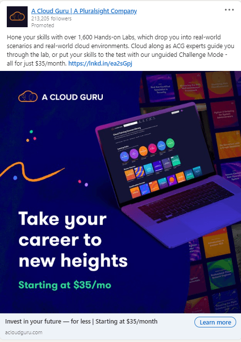
While the ad has eye-catching colors, it feels like elements have been included to fill space rather than provide real value to the ad.
💡 Tip: Unless you are planning a remarketing campaign, some would recommend to avoid price in ad graphics as it can negatively affect CTR.
Datacamp Online Learning Ads
The final ads come from DataCamp and promote two separate sales. The language used in these ads, combined with the announcement of a sale, would indicate that these ads serve a remarketing audience.

The ads certainly get the message across but aren’t setting any records for creativity. The first ad has missed an opportunity to include any features or benefits which might help secure a click. In addition, a start and end date is usually a key piece of information people look for when browsing a sale.

💡 Tip: Include dates on sale graphics to increase urgency - “24 hours remain” or “Sale ends midnight”
Keen to learn more? Take a look at our resources below.
Unlock your team's creative side.
Organize ads and help your creative marketing team work more efficiently. Get started today.
Related Posts
Social Media
What is Ad Fatigue in Digital Marketing?
