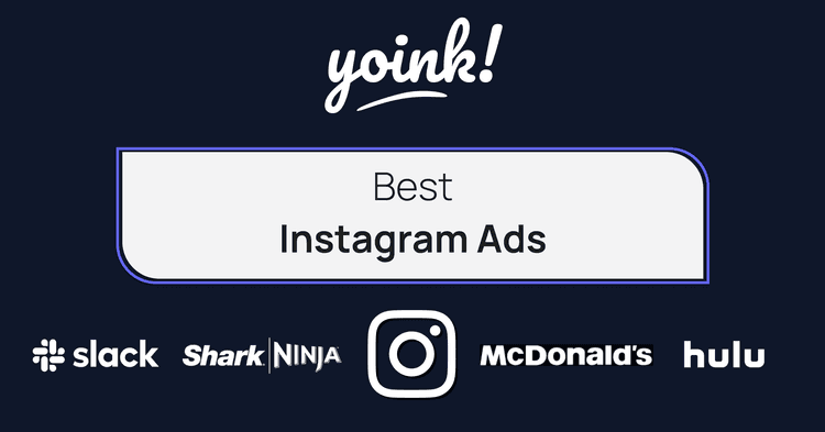
Best Instagram Ads
A person is on their phone.
They’re scrolling through Instagram.
They see your Instagram ad.
They scroll by your Instagram ad.
They’ve scrolled by your Instagram ad 😔.
What went wrong? Why didn’t they click? Why didn’t they read the headline you spent hours creating? Don’t worry; this happens to thousands of businesses on Instagram daily.
So how can this article help? One word - inspiration.
Once you have decided on the ad objective, audience, and best time to run your Instagram ads, you can begin to focus on your winning design and message that you wish to get in front of the Instagram user.
At this point, many of us will begin to experience writer’s block and struggle to get creative with ad copy and design. We have been in your position and can confidently say that the Yoink Marketing Analysts are here to help 😉.
Digital marketing is hard enough as it is, so take a look through our collection of best Instagram ads below to help kickstart your next campaign.
Table of contents
Best Instagram Ads by Industry
Great Instagram ads can appear in many formats, such as sponsored posts, video ads, and carousel ads. To ensure we showcase a variety of high-quality ads in this blog post, we have selected various ad types across multiple industries.
McDonald’s
Industry: Food
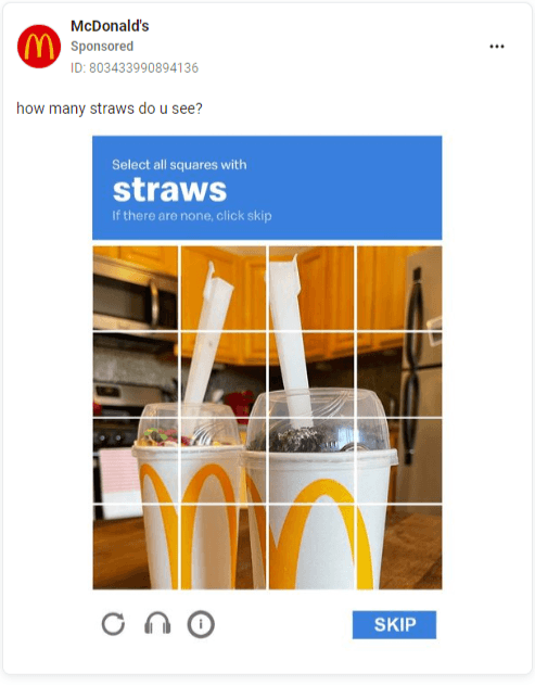
In a McDonald’s ad, you would expect to see them offering specials on big macs or announcing that the shamrock shake is now back in all locations. The ads we found, however, do neither of those things.
While McDonald’s has years of global recognition as an advantage, they still have to keep top of mind for us hungry humans thinking about our next meal.
See below as they go for a more casual approach by using a meme format to promote some of their products.
High-Quality Takeaways
Meme Ads
Did someone say meme-based advertising? Mcdonald’s marketing and design teams clearly have artistic freedom regarding their Instagram ad design. Clever, recognizable format, product placement, this meme has it all.
💡 If you have the freedom to use memes in your ads, then why not? While the meme generator is a great place to start, be sure to consult your design team before making any quick decisions.

Intentional Mistakes
‘Straws?!?.. A McFlurry doesn’t have straws?!?’ clicks skip.
Not only has this ad captured attention through its meme formatting, but it also gets eyeballs for its intentional mistake - 👏There 👏Are 👏No 👏Straws.
As we are so used to seeing the ReCaptcha robot test, it’s become a knee-jerk reaction to answer the question before proceeding. As a result, people click skip, and McDonald’s gets a click.
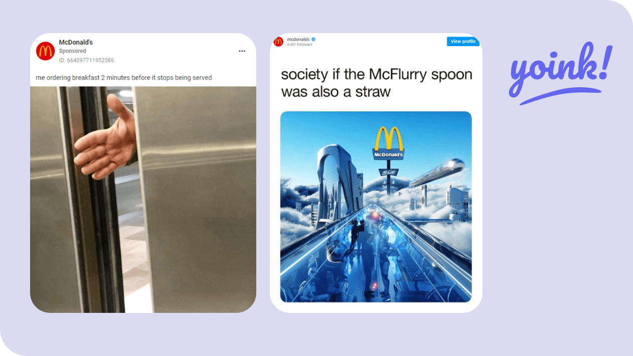
Instagram Ads from the same McDonalds digital marketing campaign
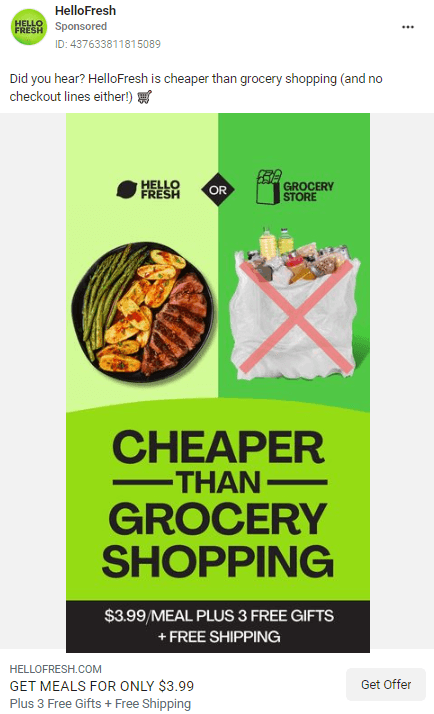
Hello Fresh
Industry: Food
In this ad, HelloFresh hits Instagram users with ad copy stating their food delivery service is, in fact cheaper than grocery shopping - a bold claim🤔
High-Quality Takeaways
Scroll-stopping Image Copy
For once, the first thing that catches your eye in food-based advertising is NOT the food itself. Putting your most significant benefit in four simple words is challenging for most businesses, but HelloFresh has nailed it.
Cheaper. Than. Grocery. Shopping.
Discounts
$3.99 for a steak dinner? Sign us up! Strong intro offers not only help to seal a sale; they give new customers a chance to try multiple products.
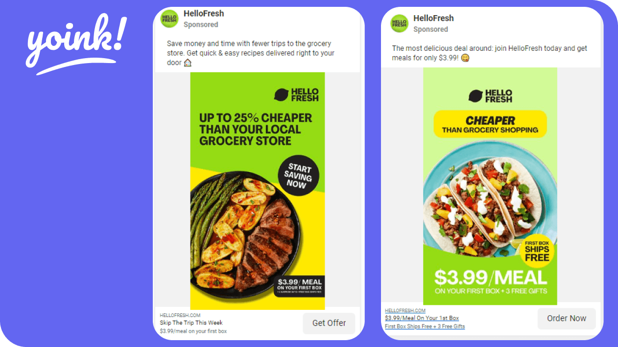
Instagram Ads from the same Hello Fresh digital marketing campaign
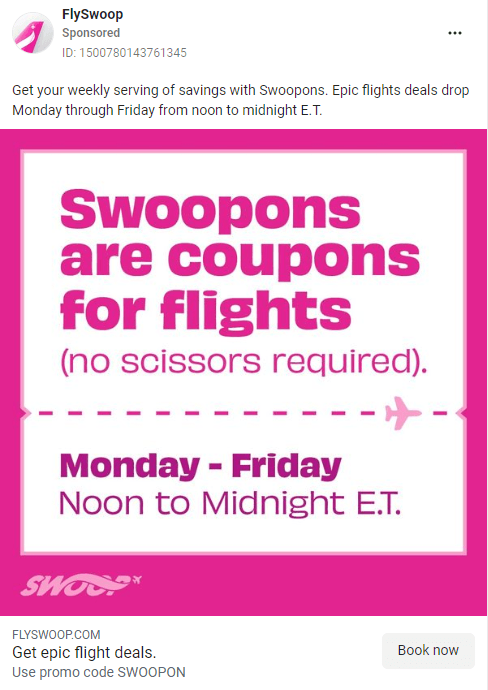
Swoop
Industry: Travel
Are you tired of using the same old “BIGSALE” or “GET10” coupon codes for sales?
The example below is Instagram advertising at its finest and is sure to kickstart coupon creativity for your next sale campaign.
High-Quality Takeaways
Coupon Creativity
Not only do Swoop create their own words for their coupons, but the ad they create to promote the coupon is quite simply an explanation of this new word - Memorable and effective.
Bright Colors
Swoop is fortunate that their primary brand colors are so eye-catching, as it helps to slow down thumb scrolling.
💡 Quick tip: Why not try using some of your brighter secondary brand colors when promoting a deal that cannot be missed?
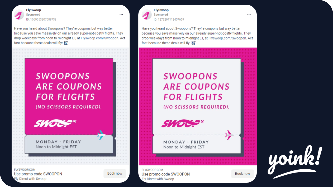
Instagram Ads from the same Swoop Airlines digital marketing campaign
Lime
Industry: Travel
Simple, bright, and strong placement.
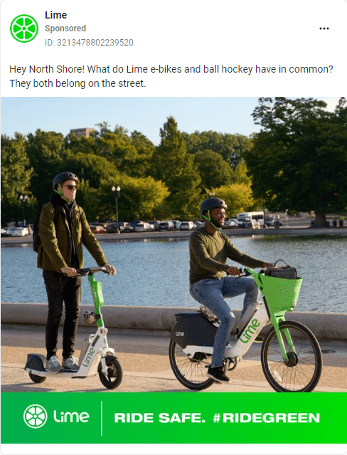
High-Quality Takeaways
Hashtag Campaign
In these ads, Lime gives a good example of a branded hashtag campaign. The message is displayed on a bright background, and visual imagery is used well to relate back to the hashtag message.
Product Convenience
These ads all have one thing in common, convenience. Some people may think that using services like Lime is more hassle than they’re worth. In these ads, they don’t only promote a ‘green’ message, showing it’s a more sustainable way for quick travel, but they have models that show off how convenient it is to actually use their service.
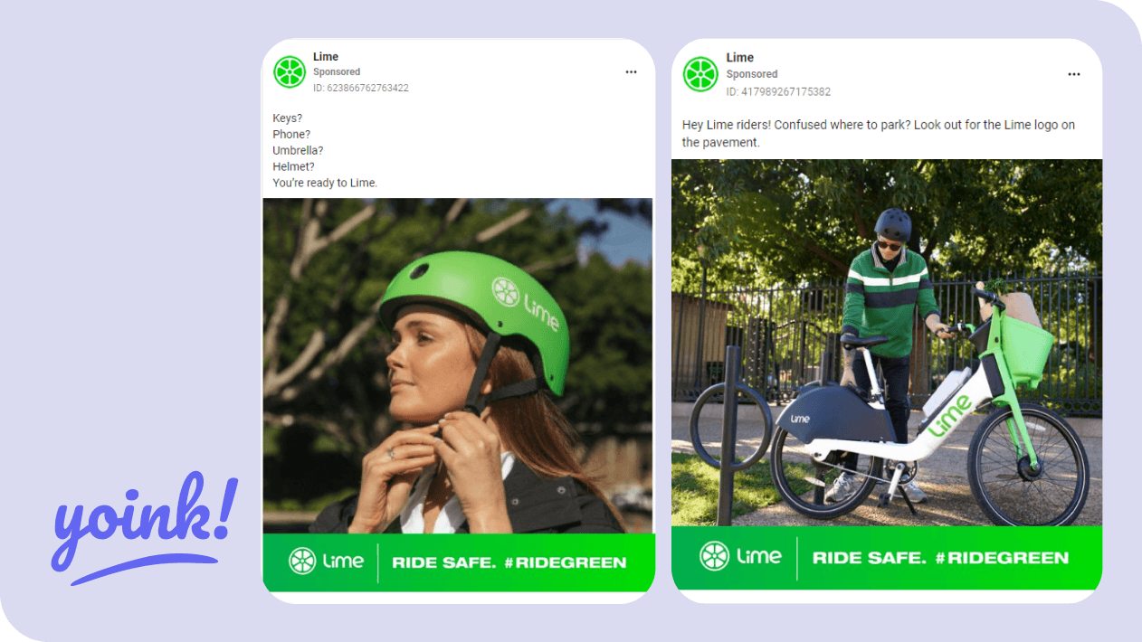
Instagram Ads from the same Lime digital marketing campaign
Slack
Industry: Software
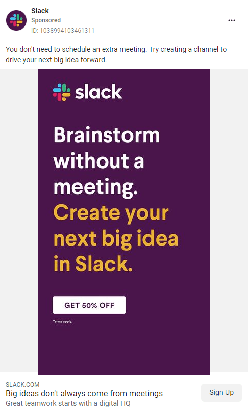 Slack is a very useful resource for brainstorming and storing ad inspiration, which is exactly the benefit they’re promoting in this next great Instagram ad.
High-Quality Takeaways
Simple Ad Format
This ad is text on a solid background. Plain and simple.
Outlining a benefit that tackles your target audience’s pain points in this style should pique interest ✔️.
Call to Action
For anybody that needs a gentle push over the line, a CTA that offers 50% off will help to get a few credit cards out. Typically a call to action will state “learn more” or “buy now.” Slack cut to the chase and used the discount as the CTA button.
💡 Quick tip: Try including a CTA button in your Instagram ads to give clear direction
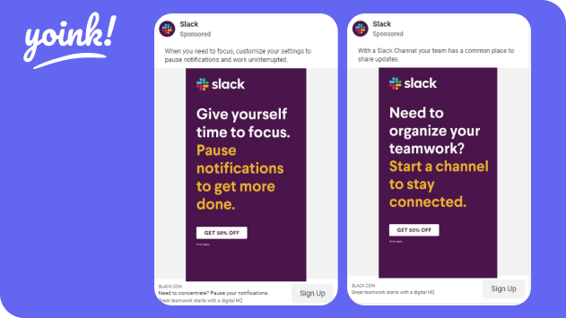
Instagram Ads from the same Slack digital marketing campaign
Canva
Industry: Software
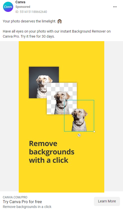
High Quality Takeaways
Demonstration Ad
With the right audience targeting, an ad with a quick product demo will speak a thousand words. This ad from Canva shows a demo that gets right to the point. Oh, and it also includes a happy dog. The dog got bonus points 🐶.
Messaging Using Benefits
Using benefits as the graphic copy is so effective in Instagram ads. If your message is right and explains how it can help tackle a customer’s pain point, then it is bound to spark interest.
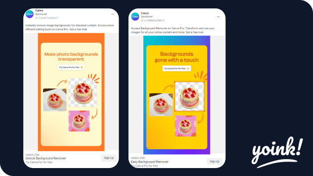
Instagram Ad from the same Canva digital marketing campaign
Hulu
Industry: Entertainment
The following ad from Hulu could be from a remarketing campaign and was shown as an Instagram story ad.
Their battle is fighting for consumers’ eyeballs, and their weapon is a small font with empty space.
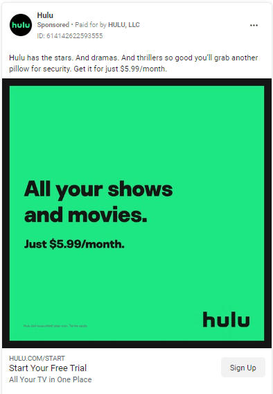
High Quality Takeaways
Small Font
Bigger is always better, right? Not for this ad! The designers at Hulu have opted for a small font size and lots of empty space.
Why choose a style that Instagram users can hardly see? Perhaps a small font might spark a natural curiosity and could encourage the ad viewer to stop scrolling and zoom in for a closer look.
💡A/B test opportunity: Next time your manager says, “that text is too small; I can hardly read it,” - let the data decide with an A/B test. Try creating one Instagram ad with a larger graphic copy and one with a smaller copy.
Less is More
The result of using a small font means that these ads have lots of empty space. With no product shots or humans smiling, there is little to distract from the primary message. Ad link
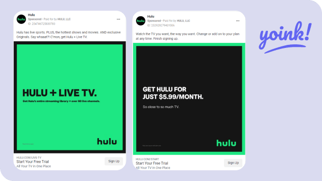
Instagram Ads from the same Hulu digital marketing campaign
Sephora
Industry: Beauty and Personal Care
When you have multiple products to offer and want to avoid basic photo ads, why not showcase your products individually by sharing solo benefits and repeating keywords that will resonate with your target audience?
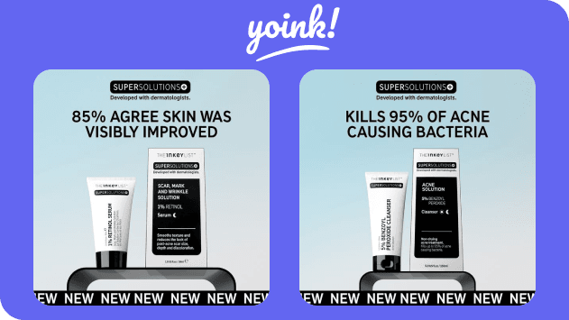
High-Quality Takeaways
Repetition
If you say it once, why not say it - 1,2,3, ...7 times?
In this ad, the “new” graphic block sets a great foundation for the ad and really emphasizes that this is a new acne product.
That’s right; it’s not an old acne product that has come and gone - it’s a new product.
Benefit Promotion
Humans are naturally curious. We see a fact, and we read the fact. Not only that, we will agree, disagree, or simply be indifferent about the said fact.
So, not only do bold caps headlines in ads show what the product has to offer in terms of benefits - when combined with a fact, they help to capture attention and can increase ad engagement.
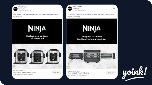
Ninja
Industry: Household Appliances
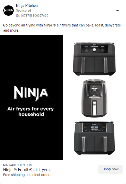
High-Quality Takeaways
Processing Fluency
In these ads, Ninja opts for a design with high processing fluency.
Big logo, one benefit, 3 product options - done.
The focus of the ad is that humans tend to prefer things that are most easy to understand. Therefore, these ads work because the less mental processing power required by our brain to understand the ad, the better.
Black and White Ads
Fortunately, Ninja’s brand colors are black and white. These colors make it extremely easy for Ninja to strip down their household appliances, clearly showing the viewer what is being presented to them and what to focus on.
Instagram Ads from the same Ninja digital marketing campaign
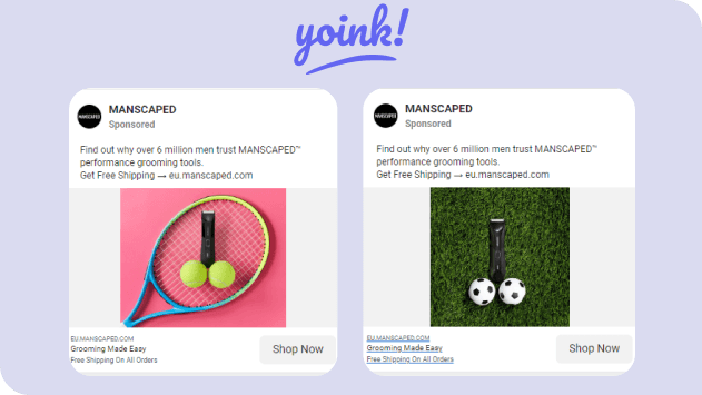
Manscaped
Industry: Electronics
While all three ad examples below aren’t from the exact same ad campaign, they all use ad graphics that show off the Manscaped product in a rather unusual setting.
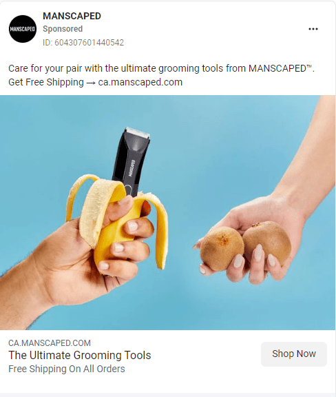
High-Quality Takeaways
Double Meaning Ad
This campaign at first seems bizarre, as Manscaped intends to show their primary product upfront, but in fact, there is another meaning presented behind the image when you look at it a little closer. This style of ad is very captivating and, when done well, can potentially achieve levels of virality.
Color Symbolism
Graphic designers across the world would squirm with discomfort at the thought of using non-brand colors in Instagram ads 😱. Graphic designers at Manscaped, however, decided to bend those rules and chose to take advantage of color symbolism. They have pink (tenderness), blue (calmness), and green (safety) - all quite fitting for a company selling male grooming devices.
Instagram Ads from the same Manscaped digital marketing campaign
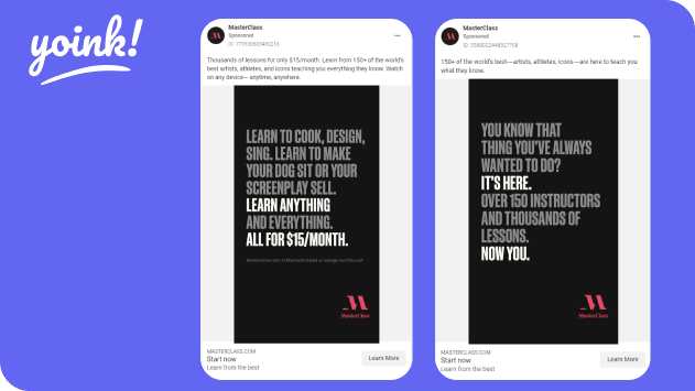
Masterclass
Industry: Self Development
Masterclass ads are usually filled with famous faces, so when we came across these ads filled with course benefits, something jumped out.
High-Quality Takeaways
Highlight Keywords
So yes, this is an ad that just lists benefits with two lines of bolded text. However, These ads use a gray font that shows benefits for their own courses to highlight the important bolded message in these ads. Typically, we might see companies use a bold font on a plain background, but these ads force you to read between the lines (of relevant copy) to get to the main message.
Meme Font
Impact font, a.k.a; the meme font, is used here, leveraging familiarity. As memes have grown in popularity over the last ten years, we’ve become more inclined to read something based solely on the font being used. A great tactic to increase thumb stop rates.
Instagram Ads from the same Masterclass digital marketing campaign
So that’s our current list of best Instagram ads. We’ll keep watching the Instagram feeds for high-quality content and continue to update this article.
Keen to learn more? Take a look at our resources below.
Unlock your team's creative side.
Organize ads and help your creative marketing team work more efficiently. Get started today.
Related Posts
Social Media
What is Ad Fatigue in Digital Marketing?