Masterclass eLearning LinkedIn Ads
Intro
If you have been thinking about online personal or team development, you have likely come across Masterclass ad campaigns on LinkedIn. This article, will first share some Masterclass ad examples, followed by a neutral review of Masterclass ad campaign techniques across LinkedIn.
TLDR
Masterclass sells the dream, and their LinkedIn ads promote this by promoting their well-known teacher base.
‘Learn from this famous individual and you could be as successful as them one day… (maybe)’
Masterclass Ad Examples
💡 How many ad examples will we share here? Could they be on a carousel?
Masterclass on LinkedIn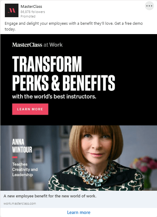
Almost all Masterclass ads on LinkedIn target a B2B audience, and follow the large 1x1 aspect ratio. 1x1 ads are currently a popular choice on LinkedIn, as 57% of users access the social platform from a mobile device.
LinkedIn Ad Copy
Typically, Masterclass ad copy on LinkedIn speaks to the team manager and highlights a key benefit of taking a Masterclass course. If this isn’t enough, Masterclass leverage familiar names of their teachers to help secure a click:
- “Engage and develop your people with a learning experience they really want. Grow your business like no other.”
- “Take your team's communication skills to the next level with the help of former FBI hostage negotiator, Chris Voss.”
- “Engage and delight your employees with a benefit they’ll love. Get a free demo today.”
- “Unlock employee potential. Empower teams with effective communication strategies from Emmy-winning television broadcaster, Robin Roberts.”
LinkedIn Ad Graphics
Masterclass graphics stand out for two clear reasons:
- Famous faces
- Impact font
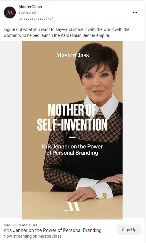 Leveraging a famous face undoubtedly piques the target audience’s interest as they scroll their social media platform. For those who don’t have famous employees at our disposal, a smiling face that isn’t fresh from Shutterstock is always a safe bet.
Masterclass ads use a font similar to the Impact font used in memes across the internet. The familiarity of this font and its legibility on solid background is enough to catch the attention of someone scrolling aimlessly on LinkedIn.
💡 Share these winning strategies in your next design and marketing brainstorm!
LinkedIn Ad Graphic Copy
When it comes to copy in ad graphics, simple, clear copy always comes out on top.
Humans have a very short attention span, so headlines cannot be more than just a few words long. The main message in Masterclass ads is typically one that pushes a user benefit:
- “Go beyond boring corporate learning”
- “Level up your sales team”
A H2 feature of their product usually follows this:
- “With the world’s best instructors”
- “From the world’s best instructors”
💡 Why not try using some of these headlines with your products?
Keen to learn more? Take a look at our resources below.
Unlock your team's creative side.
Organize ads and help your creative marketing team work more efficiently. Get started today.
Related Posts
Social Media
What is Ad Fatigue in Digital Marketing?
